Skip to content
00:00:00:00
_
EL CHEDO / BRANDING

EL CHEDO · BRANDING & WEB DESIGN

One signature, across every detail of your brand.

We design your brand’s name, story and visual identity together. Then we carry that identity across stationery, pens, packaging, spaces and your website.

Concept studies

The eight brands in this collection are fictional. We developed their names, stories and designs for this page; application imagery was generated with AI.

The world we design together

What do we prepare for your brand?

We can build a new brand or refresh your existing identity. We select the pieces you need and agree on the scope before work begins.

01

Name and story

We clarify who you speak to and what you offer. Names, taglines and copy use language your customers can understand.

02

Logo and visual identity

We design the logo, colours and typography together. We deliver usable files and a concise guide for your team and production partners.

03

Print and physical applications

Letterhead, pens, packaging, signage and workwear; shovels and site equipment where your business calls for them. We design the selected applications and prepare production files.

04

Photography and visual production

We plan product and location shoots and define your photographic approach. When needed, we use AI to produce concept and application images.

05

Web design and development

We prepare the page structure, copy and design together. We develop your mobile-friendly website and add shop or booking connections when required.

8 brand concepts

01—08

01 / 08Architecture

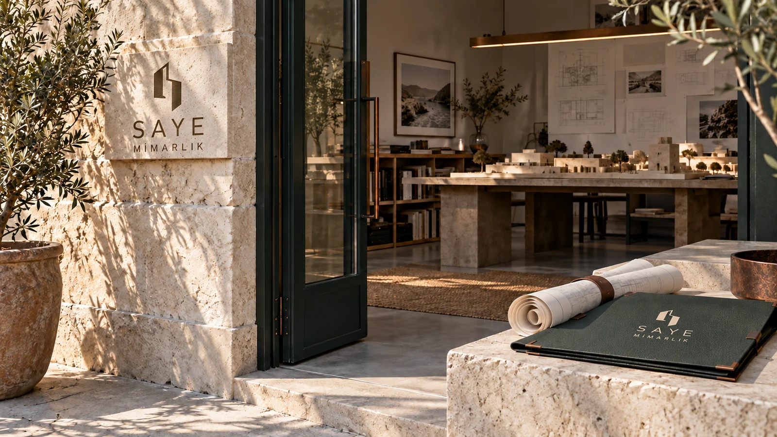
SAYE MİMARLIK

Towards the essence of space.
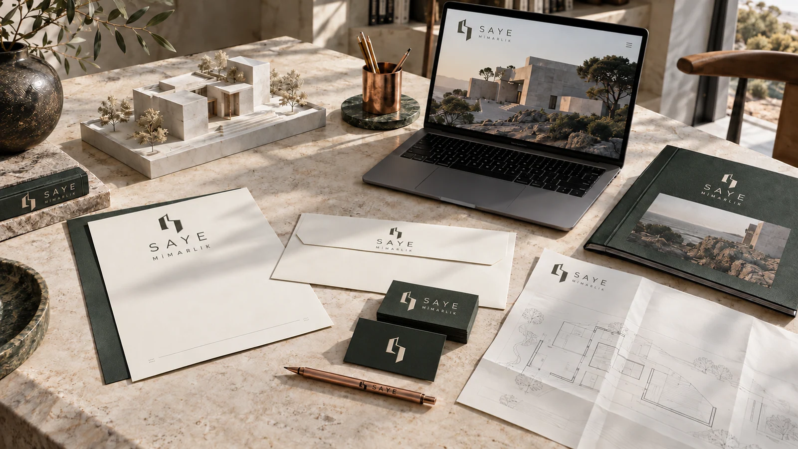
Mineral-toned stationery, project folders and identity applications for the Saye Mimarlık architecture concept
Concept image exploring the materials, spaces and digital design of fictional architecture practice Saye Mimarlık

Brand story

Saye Mimarlık begins with the relationship between a building, its light and its materials. We brought the weight of stone and the openness of a courtyard into a quiet visual language. Project folders, drawing pencils and web pages share the same order. The portfolio follows place, idea, plan and detail, with short notes explaining architectural decisions alongside the images.

Design direction

Off-white, mineral green and oxide accents. Two architectural frames with a passage of light between them form an emblem that suggests the letter S. Generous space, blind embossing and restrained typography complete the idea.

Identity details and applications

Colour palette

#E8E4DC
#343B37
#A46546

Typography

Grotesk · Mono

Applications

  • Letterhead and project folders
  • Business cards and drawing pencils
  • Presentation and proposal templates
  • Material sample box
  • Office signage
  • Site information board
  • Project-led website
Website concept

The thinking behind the building.

Project images, plans and short material notes. Visitors move from the building as a whole to its details.

See how the brand identity carries through to its web pages. Turkish preview · Opens in a new tab.
Explore the website
Back to the brands

02 / 08Architecture & Interiors

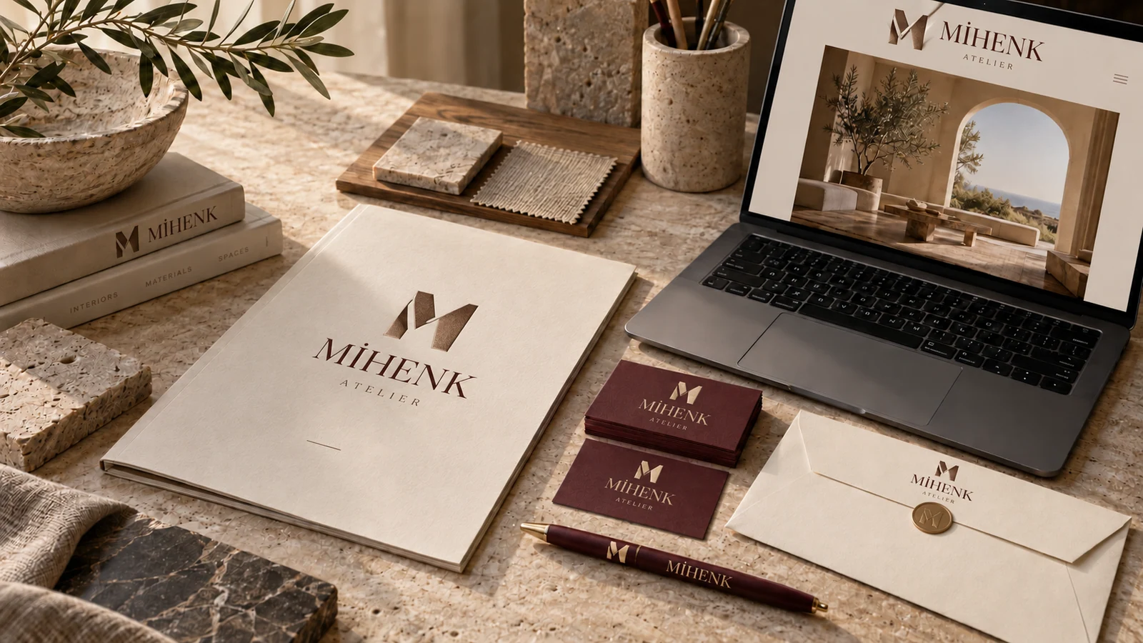
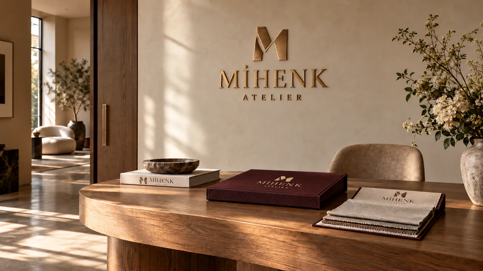
MİHENK ATELİER

Room for the details of living.

Cream and burgundy stationery, material samples and printed identity designs for the Mihenk Atelier architecture and interiors concept
Interior and brand-world concept for Mihenk Atelier, featuring warm materials and natural light

Brand story

Mihenk Atelier describes the character of a home through daily habits: morning light, a shared table and the feel of a surface. We developed that idea with warm paper tones, burgundy and close studies of materials. Sample boxes, project books and web pages focus on the same details. The spaces are presented through the time spent in them as well as their dimensions.

Design direction

Cream, wine burgundy and muted brass. Two interlocking architectural planes form a strong M monogram. Editorial serifs, fabric and timber textures bring warmth to the identity.

Identity details and applications

Colour palette

#F1EADD
#582F37
#B89A72

Typography

Editorial Serif · Sans

Applications

  • Textured business cards and letterhead
  • Metal pen and notebook
  • Bound project book
  • Fabric and material sample box
  • Studio door signage
  • Presentation and social templates
  • Editorial portfolio website
Website concept

Spaces with life in them.

An interiors portfolio built around stories of spaces and close studies of materials, with a direct route from projects to a consultation request.

See how the brand identity carries through to its web pages. Turkish preview · Opens in a new tab.
Explore the website
Back to the brands

03 / 08Real Estate

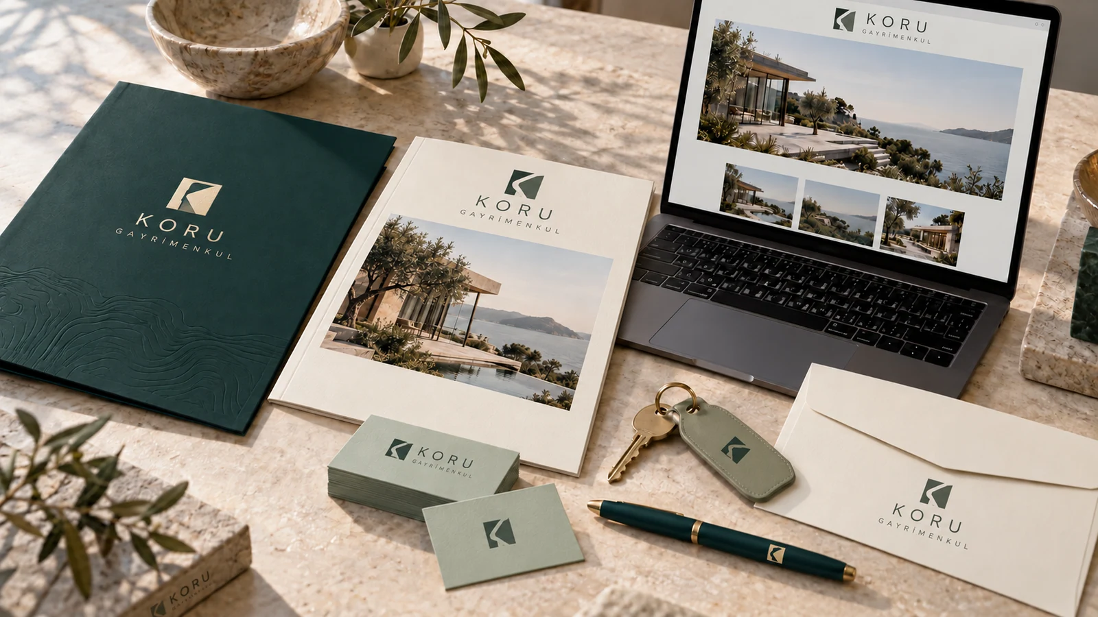
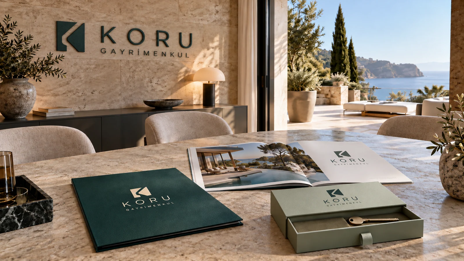
KORU GAYRİMENKUL

Make room for your next chapter.

Green business cards, property presentation folder and key handover materials for the Koru Gayrimenkul real estate concept
Property presentation, environmental branding and website concept for fictional real estate brand Koru Gayrimenkul

Brand story

For Koru Gayrimenkul, we began with the questions people ask when looking for a home: what is nearby, how can the space be used and what happens next? Green tones and clear information layouts give those questions room. Listing cards, a neighbourhood guide and a key envelope were designed together. The web portfolio foregrounds property photographs, location details and an easy-to-find contact step.

Design direction

Deep green, sage and warm white. The open space within a K-shaped emblem suggests a doorway and a floor plan. Legible typography and clear information layouts support the idea of discovering a place to live.

Identity details and applications

Colour palette

#EEEDE6
#193B3B
#B7C5AC

Typography

Humanist Sans · Serif

Applications

  • Business cards, letterhead and pen
  • Property presentation folder
  • Neighbourhood guide and listing cards
  • Key handover envelope
  • For sale and rental signs
  • Office window graphics
  • Property and location portfolio website
Website concept

Find the place that fits.

Property images, location details and a clear contact step. A simple real estate website introducing a selected portfolio.

See how the brand identity carries through to its web pages. Turkish preview · Opens in a new tab.
Explore the website
Back to the brands

04 / 08Construction

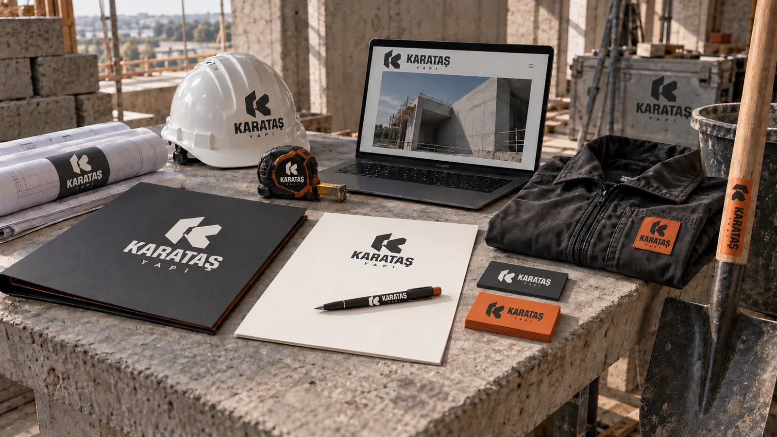
KARATAŞ YAPI

Sound thinking in every detail.

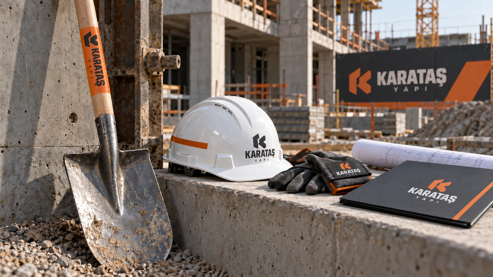
Anthracite and orange stationery, hard hat, shovel and branded site equipment for the Karataş Yapı construction concept
Construction site, equipment and digital presentation concept for fictional building company Karataş Yapı

Brand story

Karataş Yapı connects the plan on a desk with the work on site. Measuring, planning and building provide the concrete steps behind its story. We carried the orange and anthracite identity from proposal folders to hard hats, shovels and vehicles. The website presents capabilities and projects directly. Each application is designed to remain legible where it will be used.

Design direction

Concrete grey, anthracite and burnt orange. Two interlocking building blocks form the letter K. Strong typography and modular layouts carry the emblem from project folders to hard hats and site equipment.

Identity details and applications

Colour palette

#E9E8E3
#262B31
#D36A38

Typography

Industrial Sans · Mono

Applications

  • Proposal folder, letterhead and pen
  • Hard hat and workwear
  • Branded shovel and toolbox
  • Vehicle graphics
  • Construction hoarding
  • Site wayfinding
  • Projects and capabilities website
Website concept

Bringing the plan to the site.

Capabilities, project images and construction details. A short route from the company introduction to a proposal conversation.

See how the brand identity carries through to its web pages. Turkish preview · Opens in a new tab.
Explore the website
Back to the brands

05 / 08Jewellery

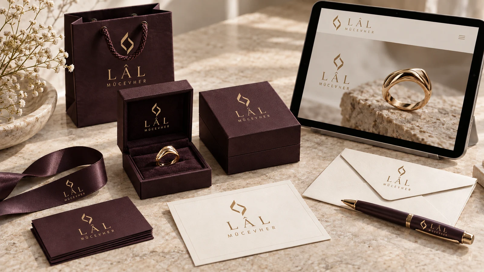
LÂL MÜCEVHER

A lasting form for a moment.

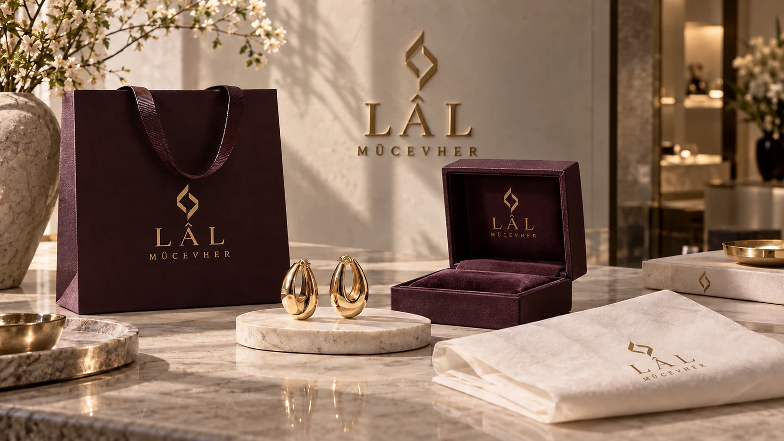
Plum and ivory boxes, stationery and muted gold packaging details for the fictional Lâl Mücevher jewellery brand
Jewellery, retail and digital collection presentation for the Lâl Mücevher brand concept

Brand story

Lâl Mücevher begins with the way a piece of jewellery becomes a personal memory. A necklace worn every day and a ring given as a gift sit at the centre of the story. Plum, ivory and muted gold preserve that intimacy. Boxes, suede pouches, care cards and collection pages were considered together. Product photographs leave room for the light in a stone and the surface of the metal.

Design direction

Ivory, plum and muted gold. Two L letterforms meet within an abstract cut-stone shape. Fine serifs, suede textures and restrained foil details are complemented by close studies of the jewellery.

Identity details and applications

Colour palette

#F5EEE3
#49313C
#BEA172

Typography

Refined Serif · Sans

Applications

  • Business cards, writing paper and pen
  • Jewellery box and suede pouch
  • Certificate and care card design
  • Shopping bag and gift note
  • Window display and store signage
  • Collection catalogue
  • Collection and appointment website
Website concept

Pieces that gather your meaning.

Collections, product details and care information. Close-up photographs lead to an invitation for a personal appointment.

See how the brand identity carries through to its web pages. Turkish preview · Opens in a new tab.
Explore the website
Back to the brands

06 / 08Boutique Stone Hotel · Cappadocia

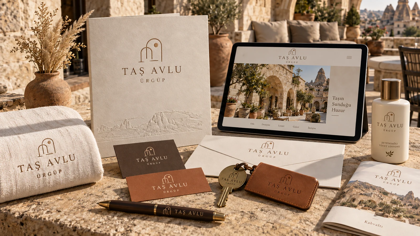
TAŞ AVLU

Where the day begins, in the courtyard.

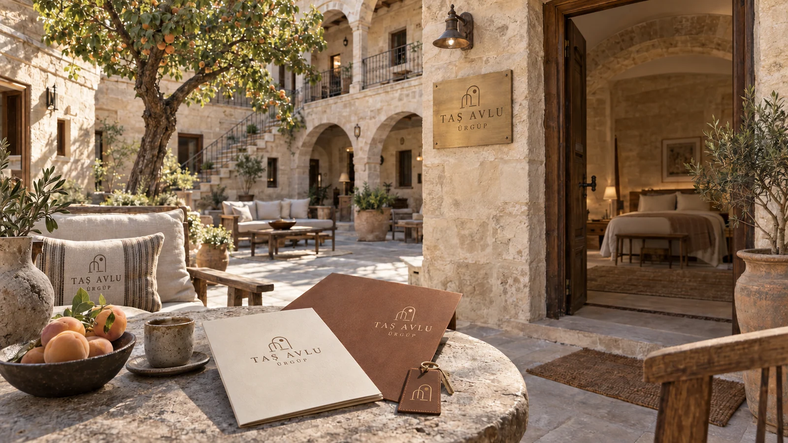
Stone and terracotta stationery, key tags, menus and room applications for the fictional Cappadocia hotel Taş Avlu
Imagined stone courtyard, natural materials and boutique hotel experience in Ürgüp for Taş Avlu

Brand story

We imagined Taş Avlu around a stone courtyard in Ürgüp. Morning shadows, breakfast outside and footsteps slowing between rooms shape the hotel’s story. Stone tones and terracotta carry through welcome stationery, brass keys and menus. Photography focuses on the walls and daylight; the web pages introduce the rooms, courtyard and surroundings in the same quiet sequence.

Design direction

Warm limestone, off-white and terracotta. A symbol combining a courtyard arch and the sun brings daylight into the identity. Linen, brass details and textured paper complete this quiet hotel world.

Identity details and applications

Colour palette

#EDE5D6
#51453A
#A46E4B

Typography

Humanist Serif · Sans

Applications

  • Welcome letter, writing paper and pen
  • Brass room key, tag and door number
  • Embroidered linen robes and towels
  • Guest amenity packaging
  • Breakfast menu and table card
  • Stone facade signage and courtyard wayfinding
  • Rooms and booking website
Website concept

Life around a courtyard in Cappadocia.

Stone rooms, courtyard breakfasts and Ürgüp. A hotel concept that introduces the rooms and the stay through photography.

See how the brand identity carries through to its web pages. Turkish preview · Opens in a new tab.
Explore the website
Back to the brands

07 / 08Cave Hotel · Cappadocia

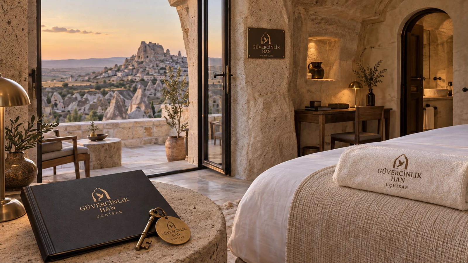
GÜVERCİNLİK HAN

Within the stone, close to time.

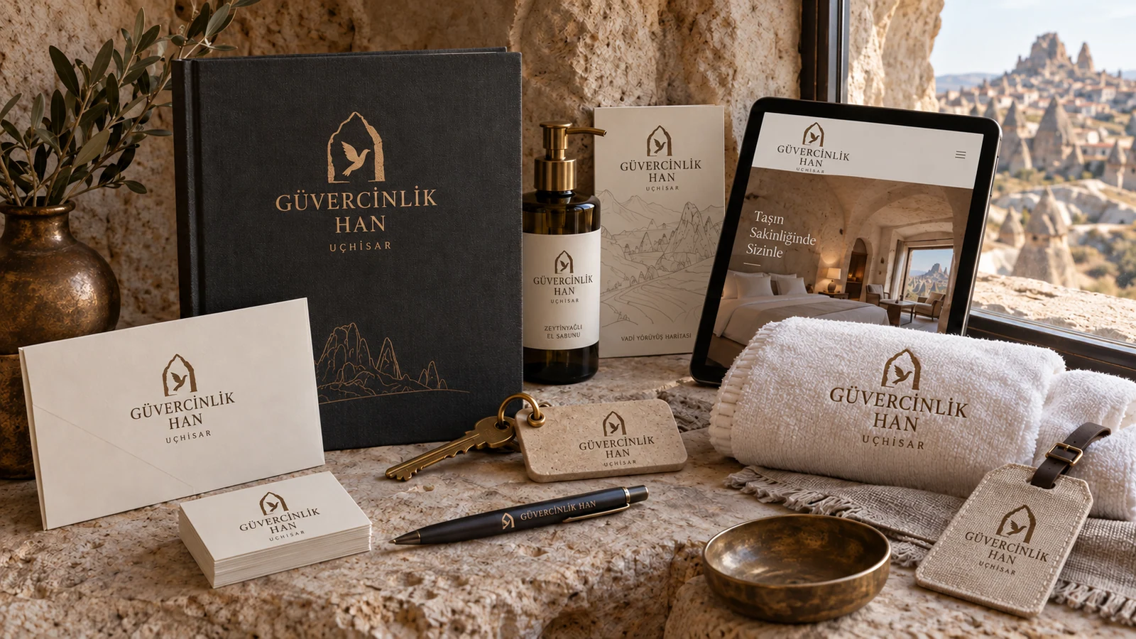
Warm stone, charcoal and aged brass stationery, keys and guest amenities for the fictional cave hotel Güvercinlik Han
Imagined rock-cut room, terrace and Cappadocia hotel world in Uçhisar for Güvercinlik Han

Brand story

We imagined Güvercinlik Han in Uçhisar, with rock-cut rooms and terraces facing the valley. Its story moves between open views outside and sheltered quiet within. Charcoal, warm cream and aged brass connect room guides, keys and guest amenities. The website presentation uses photographs to show the individual shape and texture of each room.

Design direction

Warm tuff stone, charcoal and aged brass. A pigeon and a rock-cut window meet in one simple symbol. A serif wordmark, textured paper and intimate interior photography carry that sense of place through the identity.

Identity details and applications

Colour palette

#EEE8DE
#3D4141
#A28B63

Typography

Classical Serif · Sans

Applications

  • Welcome card, writing paper and pen
  • Brass room key and tag
  • Room guide and local discovery card
  • Embroidered robes, slippers and towels
  • Guest amenity and box design
  • Door plaques and terrace wayfinding
  • Room discovery and booking website
Website concept

A stay sheltered within the rock.

Rock-cut rooms, terraces and views of Uçhisar. A hotel concept highlighting the shape, materials and atmosphere of each room.

See how the brand identity carries through to its web pages. Turkish preview · Opens in a new tab.
Explore the website
Back to the brands

08 / 08Olive Oil & Product Brand

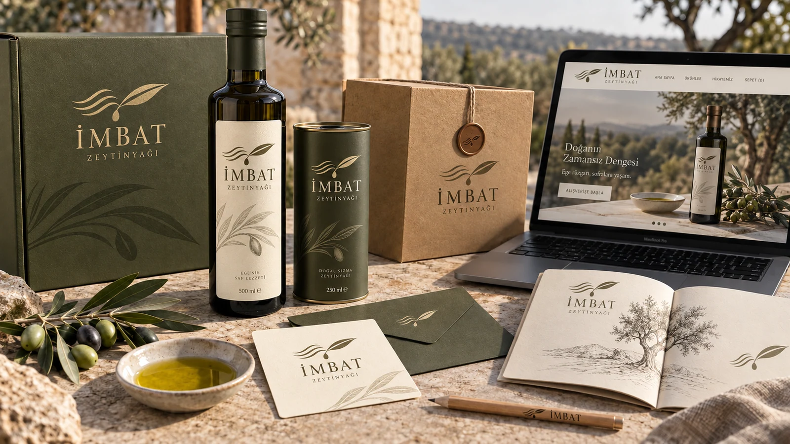
İMBAT ZEYTİNYAĞI

An Aegean breeze for the table.

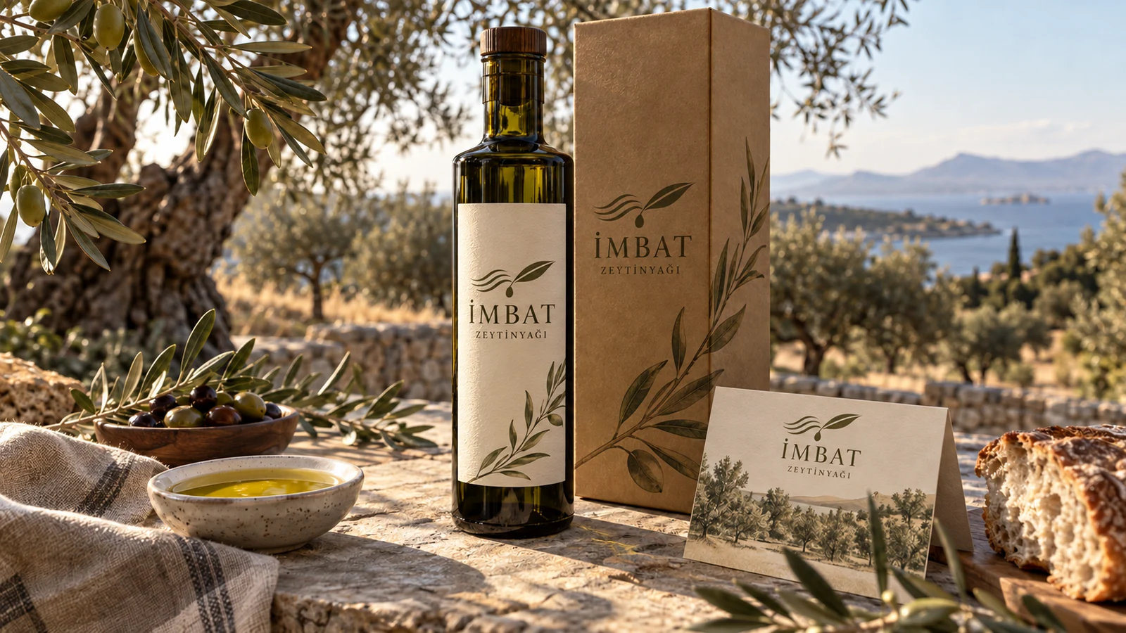
Olive green bottle labels, packaging, tasting cards and stationery for the fictional İmbat Zeytinyağı olive oil brand
Grove-to-table visual world and digital shop concept for fictional product brand İmbat Zeytinyağı

Brand story

İmbat Zeytinyağı starts with a cool Aegean breeze passing through olive leaves. A leaf changing colour in the light and bread on the table provide its visual references. Green and linen tones bring bottles, tins, tasting cards and gift boxes together. Labels give product information clear space; web pages introduce the oils through serving and pairing ideas.

Design direction

Olive green, pale linen and earth tones. Three lines of wind and a single olive leaf turn an Aegean breeze into a simple emblem. Organic serifs and textured labels are complemented by product photography in daylight.

Identity details and applications

Colour palette

#EAE6CF
#43503A
#9E633B

Typography

Organic Serif · Sans

Applications

  • Bottle label and tin design
  • Gift box and shipping carton
  • Tasting and product information cards
  • Letterhead, notebook and pen
  • Tote bag and apron
  • Shelf and point-of-sale materials
  • Product and e-commerce interface
Website concept

A table story that begins with a breeze.

Products, flavour profiles and serving ideas. The packaging colours and wind symbol continue through the shop concept.

See how the brand identity carries through to its web pages. Turkish preview · Opens in a new tab.
Explore the website
Back to the brands

EL CHEDO / BRANDING

How we work.

  1. 01

    Define the need

    We review your business, customers and existing materials, then agree on deliverables, schedule and budget.

  2. 02

    Choose a direction

    We present naming, story and visual proposals through concrete examples. Your feedback helps us choose a direction.

  3. 03

    Design the pieces

    We apply the chosen identity to print, spaces and web pages. We review the designs together in their intended settings.

  4. 04

    Deliver the work

    We prepare print files, brand guidelines and the website. We get your final approval before launch or production.

Questions before we begin.

Can we keep our existing logo?

Yes. We can retain what works and focus on colours, typography, copy or applications. We agree on the changes you need at the start.

Can print and a website be part of one project?

Yes. We can plan the identity, selected applications, copy and web development within one scope. The proposal lists each deliverable.

Are printing and production included in the price?

We prepare designs and production files within the agreed scope. Printing, manufacturing, hosting and external services are listed separately; we agree on responsibilities before starting.

How do we choose a new name?

We present name options suited to your business and audience. Domain availability and the necessary brand-name research are addressed separately before commercial use.

What should we share to get started?

Tell us what you do, who you want to reach and which materials you need. Share your existing logo, website and brand files if you have them.

The next brand could be yours.

Let’s start with your brand.

Tell us about your business and priorities. Together, we will agree on the designs you need, the schedule and the budget.

Tell us about your project