You present the image. The person opposite looks for three seconds and says "nice, but something is off." They cannot say what. Neither can you, because you have been staring at that frame for two days.
That feeling can come from a mismatch between lighting, materials or facial detail. It can also mean the chosen style differs from the photograph the viewer expected. Our job is to turn “something is off” into an observation that can be corrected.
A photographic impression comes from consistent relationships across the frame, rather than a single texture effect.
1. The skin is too clean
Real skin has pores, fine hair, vascular translucency and uneven oil sheen. Light enters skin, scatters beneath it and exits again. That effect is called subsurface scattering and it is what gives skin tone its depth.
Some generations render skin too smooth. An upscaler that does not preserve texture, or excessive retouching, can remove surviving micro-detail. That can create a plastic appearance; clean skin alone does not establish the problem.
2. Shadows do not follow the light
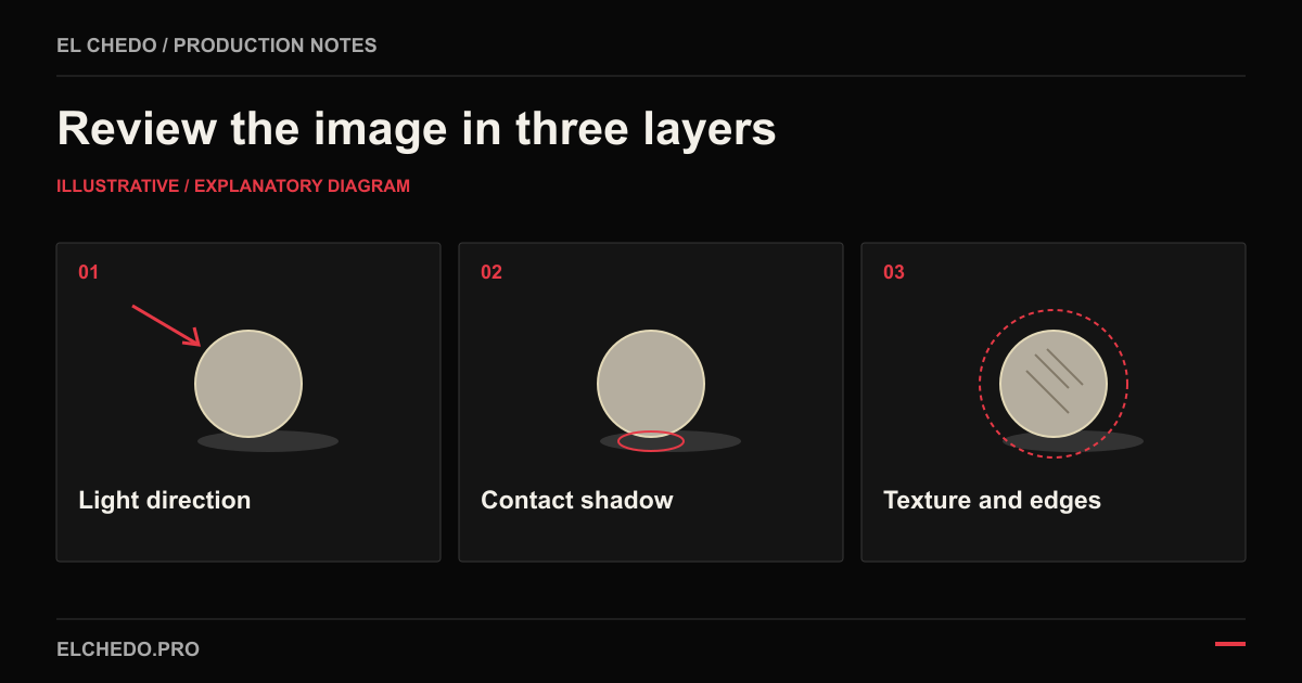
In a simple scene with one dominant light, shadow direction and hardness should agree with that source. Perspective, different surfaces and additional lights can change their appearance. Describe the assumed lighting setup first, then compare the shadows with it. A generated frame can appear convincing while getting this relationship wrong.
The most commonly missed detail is the contact shadow. Where an object meets a surface, light is occluded and that junction darkens. Without it, the object does not sit on the ground, it looks pasted onto it.
3. Reflections are not talking to the room
Glossy surfaces reflect their surroundings. Glass, metal, polished leather, eyes. The model often produces a convincing reflection texture that reflects nothing actually present in the scene.
- Compare the catchlight with the lighting setup; camera and eye angles can change its appearance.
- Reflections in both eyes should be explainable by the same scene; they need not be identical.
- The reflection on product packaging must obey the geometry of the studio box.
- In water and glass, perspective refraction has to bend the correct way.
4. The blur is a filter, not optics
In a real lens, depth of field is gradual. Blur increases progressively with distance from the focal plane, and point light sources take on the shape of the aperture.
Generated images often blur the background in a single step. There is no transition. The subject edge is razor sharp and immediately behind it is mud. The eye reads that as a mask, not a lens.
| Check | A reason to inspect |
|---|---|
| Focal plane | Unexplained sharpness differences between similar surfaces at the same distance |
| Depth transition | An abrupt mask-like blur at the subject edge |
| Point lights | Shapes inconsistent with the intended lens and aperture |
| Edges and corners | Unexplained changes in sharpness or colour within one scene |
5. The symmetry is too perfect
Real faces can carry small asymmetries in brow height, eye opening or the direction of a smile. Some generations make these details too even. Use the person’s approved reference; random asymmetry does not establish identity accuracy.
Excessive symmetry can remove character from some realistic portraits. In a stylised campaign it may be deliberate. Judge the frame against the intended person and visual style, rather than a rule that every face must look imperfect.
6. The fabric does not know about gravity
How a fabric falls depends on its weight, its weave and where it is suspended. Silk falls one way, linen another. A seam follows the form, and the fold begins there.
In generated images the folds can be decorative. They look pleasant but have no logic. In fashion imagery that is the first thing an informed buyer notices, which is why drape control is a separate stage in AI fashion visuals.
7. Hands, teeth, jewellery
These three are the classic weak points. Models have improved, but complex hand poses, tooth alignment in an open mouth, and repeating fine structures such as thin chains can still break.
A small local problem may respond to regional editing. Repeated identity or geometry errors may call for another reference, regeneration, compositing a real asset or a shoot. Record the chosen method and the product detail it must preserve.
8. Colour too saturated, contrast too clean
Generative models lean toward visually striking output. High saturation, crisp contrast, even illumination everywhere. In real photography light falls off, shadows close, and colours shift with the environment.
If a brand uses a restrained palette and deep shadows in its approved references, an oversaturated output can drift from that direction. Brightness is not itself a quality defect. Judge colour against the brand reference and the screen or print placement.
9. The texture repeats itself
Wall texture, crowds, foliage, grains of sand. Over large areas the model can repeat the same pattern. It goes unnoticed on its own, but it returns to the eye as a sense of artificiality.
The production line that closes all nine
There is no single fix for these nine items. The production line at El Chedo AI Studio in Antalya handles them in separate stages.
Set the light first
Define the direction, hardness and colour relationships before generation. Where the tool supports them, use references or structural controls, then visually check whether the output follows the intended setup.
Generate in layers
When a scene cannot be controlled in one pass, subject, ground and atmosphere can be handled separately. Recheck shared lighting, perspective and contact after the layers are combined.
Composite the real asset
Logos, labels, legible text and where necessary real product photography are laid over the generation.
Give the optics back
Adjust depth of field, edge transitions and, where appropriate, grain to suit the intended photographic style. Chromatic fringing and grain are optional. Clean product photography can also be convincing; effects should not conceal an unresolved error.
Run a retouch pass
Inspect contact shadows, skin texture and reflection relationships before delivery. Choose corrections against the actual reference and publishing size; every frame does not need the same retouch.
The goal is not a perfect image. It is a believable one.
Review in three passes before delivery
The whole frame at publishing size
View the image at its intended size first. Check light direction, weight, the main subject and space for copy. Decide whether the target is realistic photography or a stylised illustration, then write the acceptance criteria.
Details at full size
Inspect the file at 100 percent. Compare hands, jewellery, seams, logos, contact points and mask edges with the real reference. Record the location of each issue using the filename and a short observation.
Delivery formats after correction
Reduce the corrected image and check the planned crops again. Does a revised shadow agree with neighbouring surfaces? Does added texture match the rest? A corrected file still needs approval.
A light, shadow, fabric and lens review form
| Check | Relationship to review | Before acceptance |
|---|---|---|
| Light | Do the key light, bright areas and reflections describe one scene? | Describe the lighting setup in one sentence. |
| Shadow | Are direction, hardness and contact with the ground coherent? | Allow for additional lights and different surfaces. |
| Fabric | Do seams, weight, tension and folds match the product? | Compare the pattern and seam count with a reference. |
| Lens | Are the focal plane, near-to-far transitions and cut-out edges coherent? | Do not treat grain or fringing as mandatory. |
| Product and jewellery | Are proportions, component count, stones, fastenings and lettering correct? | Do not fix lighting by changing the product shape. |
Download the image review form as CSV. Light, shadow, fabric and lens rows support general inspection; use stone and fastening rows only when relevant. Replace the ILLUSTRATIVE row with your observations. The form contains no customer work or measured quality result.
Review product representation alongside the product photography shot list. For fabric and collections, read the limitations in the AI lookbook guide. For a product changing between frames, see the brand consistency article.