'Make it more cinematic' can start colour work, but it does not define the result. Darker shadows, a warmer setting, lower saturation and stronger product colour need different decisions. What you like in a reference may actually be its lighting or set. Before choosing software settings, explain the feeling you want and the details that must stay unchanged.
1. What do correction and grading solve?
Correction and creative grading can use the same tools, and their names sometimes overlap in everyday use. Separating their functions helps when briefing. Adobe's basic correction documentation lists exposure, white balance and contrast as balancing controls. Choosing a visual character adds another decision to identifying what needs balancing between shots.
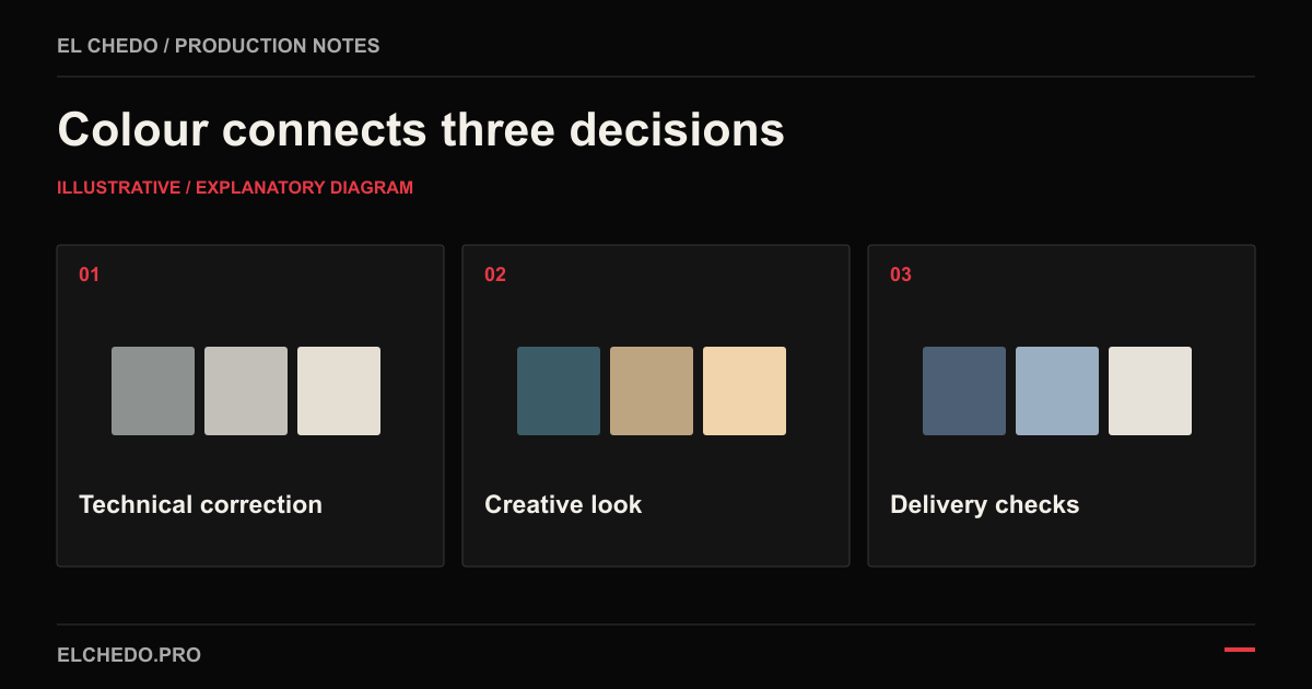
| Task | Main question | Example decision |
|---|---|---|
| Color correction | Are shots technically consistent? | Remove an unwanted green cast from one shot. |
| Color grading | What atmosphere should the film carry? | Keep the warm setting with more restrained shadows. |
| Colour management and delivery | How will the file be interpreted at its destination? | Match the input image and delivery colour space correctly. |
Every scene need not have the same look. A hotel's restaurant at night and room in daylight can retain their own atmosphere. Consistency means controlling unwanted differences at cuts and maintaining a shared visual language, rather than painting every scene the same colour.
2. Colour work does not replace shooting light
Parts of an image can be adjusted in the colour stage. Even so, light direction, reflections and product separation need attention on set. Detail never recorded cannot be recovered through colour adjustment alone. Inspect the source file to assess remaining information in a bright window or dark fabric. Promising a later fix for every problem is unrealistic.
Share the colour reference with the cinematographer before shooting. Discuss a test image when skin, food, jewellery or packaging colours matter. Agree whether mixed light sources are intentional or an unwanted colour clash. A preferred preset or LUT cannot automatically resolve every shot's lighting and exposure differences.
3. Write a colour brief with specific preferences
Add a short colour section to the commercial film brief. Two or three references may suffice; explain the quality you like in each. Describe the desired behaviour of skin, background, shadows and product. The draft below demonstrates the method rather than asking for an exact copy of another film.
| Field | Preference to record |
|---|---|
| Atmosphere | A warm workspace without turning the white product into a yellow variant. |
| Contrast | Keep desk and fabric detail visible in shadows. |
| References | Warmth in the first reference; product separation in the second. |
| Protected colour | Check the body and packaging against the approved product reference. |
| Approval and use | One contact; sample scenes first, then the full film prepared for web. |
Approve product accuracy separately from mood. Metal reflecting a warm environment differs from changing the metal variant on sale. Our jewellery product accuracy guide also explains how to review that distinction.
4. Start with samples, approve the whole film
Review the first proposal on shots representing different conditions. Include skin, product, dark areas and bright surfaces, instead of choosing only the easiest or prettiest frame. Agreeing on direction here gives better control than requesting a different look after its application to the entire film.
Choose a direction
Review sample scenes with the references. Agree on warmth, shadows, saturation and protected colours.
Review the edit
Watch the approach across the full film. Check whether product colour, faces or surroundings change unintentionally at cuts.
Consolidate feedback
Give timecoded notes on one file version. Specify the scene and detail to change, instead of asking for 'more premium'.
5. Define the delivery profile for the destination
Colour management handles transformations between camera images, working environment and output. Blackmagic documents these transformations and scopes for evaluating image data. The brand need not choose every setting; it should know the intended publishing environment and which file was approved.
Record SDR or HDR expectations, target colour space and file requirements. An SDR web delivery might use an agreed Rec. 709 approach; that does not make every screen identical. Flag any different publishing standard early. Request a suitable output and review plan rather than using an unchecked HDR file as if it were an SDR file.
6. Check the final file in actual use
Approval should extend beyond the working software's preview. Inspect the exported file and, where possible, a test upload on the publishing platform. Keep viewing conditions reasonably stable. Resolve conflicting comments made under automatic screen colour changes through a shared review.
- Do product and skin colours match approved references?
- Are there unintended colour or brightness jumps at cuts?
- Is required detail retained in dark and bright areas?
- Is the delivered file the approved version?
- Are output profile and file requirements documented for the destination?
When planning film production and post production with El Chedo, share existing footage, colour references and publishing destinations. The proposal can then explain the colour goal, source limitations and approval process together.